STARLINE - The Beach Boys
on 45
 |
USA Starline Tan / Avocado label |
|
| Tan label - C-logo | Tan label - C-logo (w/ "All Rights Reserved" mentioned) | Tan label - Dome-logo |
An introduction
The Starline series on
the Tan or Avocado labels can be considered the most difficult one to collect.
These labels first appeared in November 1972 and were used through November
1981. The earlier issues were adorned with the “C-Type” logo (through March
1978), which was then replaced with the “Dome-Type” logo. And as you will see
below, there are labels which vary in shade and color from Tan to Brown to Grey
to Avocado Green, which does cause this series of re-issues to be a living
nightmare for every Beach Boys STARLINE Collector.
But with 3 pressing plants fabricating and pressing the singles (the Scranton,
PA plant had now closed and did not press this label style), it seemed, there
was little regard for what each other plant was doing. Most decisions on
pressing details, were done somewhat independently of the other factories. And
even though most of the fonts are consistent, those used on the West Coast (ie
Los Angeles) pressings, do tend to be a slight bit wider and spaced slightly
wider as well. One clear exception are the 6081 Help Me, Rhonda pressings from
the Jacksonville, IL factory, where a larger font was used. It's unique to this
release, and appears on three variations. But Jacksonville, IL, also pressed
6081 Help Me, Rhonda, in a smaller font, which is more similar to the Los
Angeles font as well! How's this for craziness? And there may be more!!
Gold?
And why such different shades in color? At some point, probably in late 1971, it was decided to change the current Red and White Target Starline Label to a new type. Capitol, at this point, wanted to recreate the “old” GOLD Starline label like first used, when the label appeared in the late 1950s (see pictures below). But reports and research suggest this GOLD paper (with traces of real “gold dust”) had become increasingly expensive. To counter this, Capitol tried to find alternative sources for paper stock, which looked as “gold” as possible. While some plants tried to create a “gold” colored paper themselves, others contracted with outside sources (ie Bert Co *). In both cases, there was limited success in getting the color just right. Result: a wide range of colors and shades. Thus, some labels look Tan or Brown, while others are Grey or the Avocado Green, as the scans of the labels (in the Tan/Avocado overview) reveal. We’ve attempted to document as many different pressings (many with the same titles and label details) from the different plants, as we could find.
* Bert-Co was a company which printed labels for the Los Angeles Plant and may have done so for the others as well, but details are unclear.
|
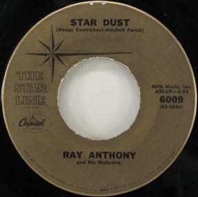
An example of the "real" gold Starline label as they appeared in the late 1950s (left and middle), and the result of an attempt to create a similar label-color in the 1970s (right) |
||
|
|
.jpg) |
|
Publishing company
Another thing contributing to the variations, albeit inadvertently, was the sale of the Sea of Tunes Publishing Company to Irving Music, Inc, by Murry Wilson in late 1969. Since correcting the publishing notations seemed to take many years, many of the singles issued in 1972, when these Tan/Avocado variations first appeared, continued to still show “Sea of Tunes” as the publisher, which was of course, incorrect. As singles had new stock reprinted, sometimes a factory would correct the publishing to say “Irving”, but many continued to be re-issued with SOT. As corrections were made, and/or new pressings issued, different paper stocks again were used and even more color variations appeared. But not all singles were corrected during this time, and in April 1978, when the “Dome-Type” logo replaced the “C-Type” logo in this series, some SOT notations still remained. (In November, 1981, the STARLINE label changed from Tan/Avocado to Light Blue. And at this time, there were still some labels incorrectly showing the SOT notation!!).
And to further complicate matters, after September 1975 most of these Tan/Avocado releases had the “All Right Reserved” (ie ARR) notation added to the bottom edge of the label, which required still again, new pressings, which again also added different shades. In some cases, both sides of the label had different colors! And in one record we’ve documented (6095 Surfin' Safari / 409), the ARR was added on one side’s label, and the other side was without! Perhaps this factory, had a stock of “older” labels it was trying to use up.
At this same time (in Sept 1975), many of the singles also had a MONO or STEREO notation added to the label. For some reason different factories added the notations, and others did not. (Note: All the reissues are MONO, except the 6107 Surfer Girl (A-side), which contained the infamous “Binaural Mix” (one pressing does has the MONO mix on the 6107 A-side, see the Tan/Avocado overview), and the 6259 Barbara Ann/Little Honda (a Starline Re-issue of the Capitol 4110 pairing from the SPIRIT OF AMERICA album) which has a “Duophonic” Barbara Ann , and “True Stereo” Little Honda — on this one both sides of the label correctly say “STEREO”)
Tan variations
Thus, this revamped ARR-series of the Tan STARLINE SERIES not only added new color variations, but appeared in 3 sub-variations as listed:
-- First with NO designation of MONO or STEREO,
-- Second with the MONO designation,
-- And last with the STEREO designation.
The mix heard is always the original Single MONO mix (except on 6107 and 6259).
And when the DOME Logo was issued in April 1978, there were again new variations in color, plus these issues appeared with these sub-variations:
-- First with NO designation of MONO or STEREO,
-- Second with the MONO designation,
-- NONE had the STEREO designation.
So – concluding – we have 3 different main variations with several
sub-variations:
1. C-logo
- publisher designation “Sea Of Tunes”
- publisher designation “Irving” (as corrected on some issues)
- NONE have the MONO or STEREO Notation
(Some could exist, but haven’t been found)
2. C-logo with
designation “All Rights Reserved”
- publisher
designation “Sea Of Tunes”
- publisher designation “Irving” (as corrected on some issues)
!! plus !!
- the correct MONO-designation
OR - the correct STEREO-designation
OR - No MONO- or STEREO-designation at all
3. Dome-logo
-
publisher designation “Sea Of Tunes”
- publisher designation “Irving” (as corrected on some issues)
!! plus !!
- The correct MONO-designation
OR - No MONO- or STEREO-designation at all
AND - ONLY ONE has the STEREO-designation (6259 BA/LH).
The overview offered here is a near complete picture of what was released, but
one must understand it’s near impossible to get a 100% correct view of this
issue. For this “overview” we combined the collections of a couple of “hard
core” fans who bought most of these records, when they were first released. And
even then, there appears to be “speculated holes” in the collection. Of the few
pressings which are speculated to still be missing on this page, it’s generally
assumed they may exist, but are hard-to-find, because of the low quantities
which may have been pressed. But again…it’s speculation.
Sleeves
Now for the sleeves: Again, it’s a trip to the “Twilight Zone”. The first Starline-issues on the tan-label were issued on the well known Red sleeve with the White circles. The sleeves on the first issues did have the Dome-type logo (like those used for the Red and White Starlines), but eventually it was changed to the C-Type logo, as was on the label.
|
Red/white sleeve with dome logo |
Red/white sleeve with C-logo |
Green/white "misprint" sleeve |
|
|
|
|
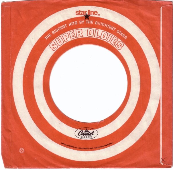
To make the story even more interesting: A variation of the sleeve was issued, with the same patterns, but in Green. Some have generally assumed these were specifically made for the Avocado colored labels. And why? Because there was some speculation these re-issues were first printed in the “Avocado Green” shade by each factory, and then later, a switch was made to print them in Tan or a browner label. But this is completely wrong, and the main reason is that there are “Avocado” colored labels found on copies done in Sept 1975, when the “All Rights Reserved” disclaimer was added. So this argument has little or no credibility since Avocado labels appeared at such a late time, as well.
So, why were these done in Green then? It appears to simply be a mistake by one of the East Coast factories. Rather than destroying the sleeves, Capitol decided to use them. But it’s still not 100% clear why the sleeves ended up as “green”. Perhaps mixing colors to try to come up with something “gold”, may have taken a very bad turn? Either way, the Green sleeves do exist, and many of the STARLINES in the Tan/Avocado series, came with them.
|
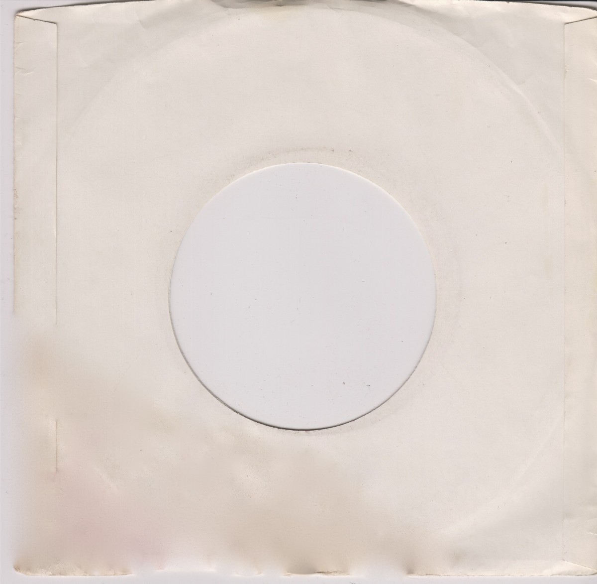
Plain white glossy sleeve as was used for the Tan Dome 6205 Wendy/Little Honda 45 |
||
|
|
|
|
Lastly, one collector confirmed that for a short period of time a temporary plain white sleeve was used. They have said they bought a brand-new stock copy of 6205 Wendy/Little Honda (dome logo), which had this “white” sleeve. A scan of this sleeve is shown above. No Capitol Records logo or notation was used. It could be "just" a plain white or generic sleeve, but as these 45's with the Dome logo were the last to appear on the tan-label, a shortage of sleeves could be the cause as well. We don't know, so if anyone can shed some light on this we would appreciate an e-mail.
Enjoy!!